

Blitz.
Blitz exists to put the sexy back in sober. In a category full of compromises, it flips the narrative—this isn’t your sponsor’s soda water. It’s bold, unfiltered, and unapologetically fun.
Built on contrast—where chic meets “should she be doing that?”—Blitz taps into the tension behind skipping the hangover. While other brands sell purity, Blitz sells something better: the freedom to choose yourself—fully, confidently, and without compromise.
visual identity
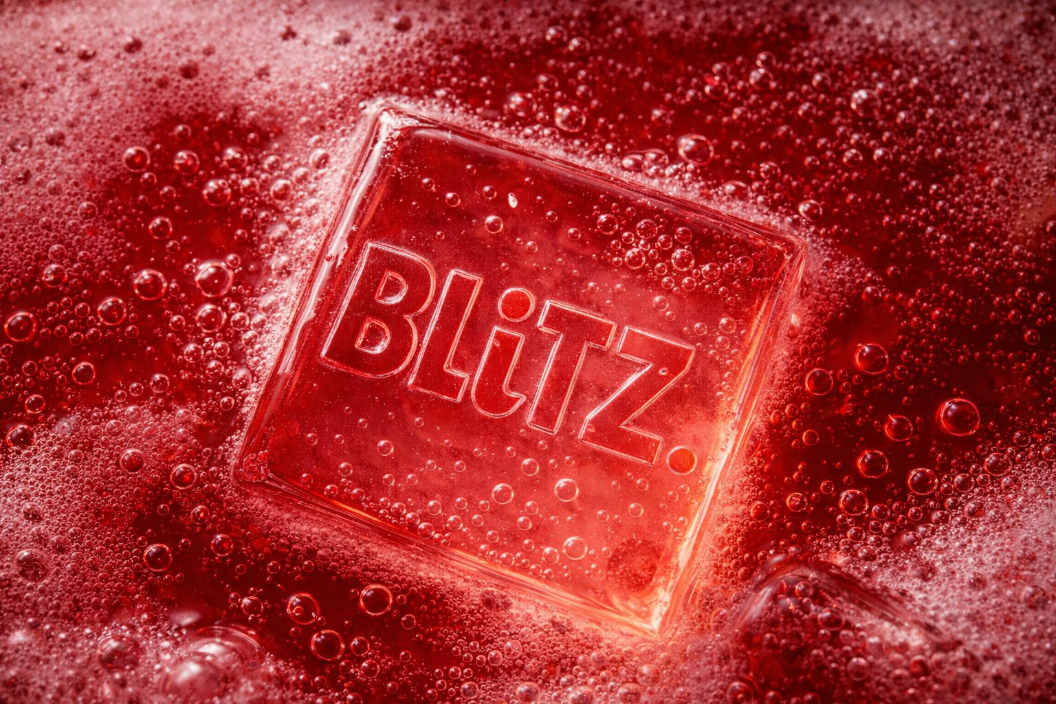
The Logo
Chunky, modular, and slightly off-balance, the Blitz wordmark takes up space unapologetically. Retro-adjacent with a modern edge, it was designed to feel bold, playful, and impossible to ignore.
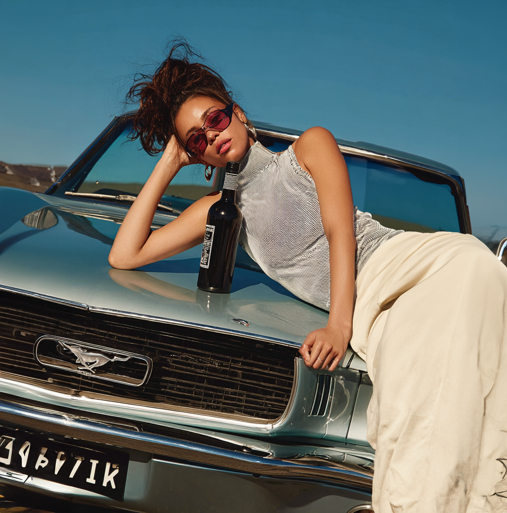
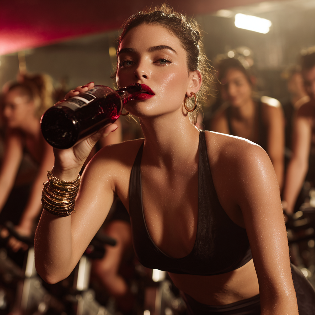
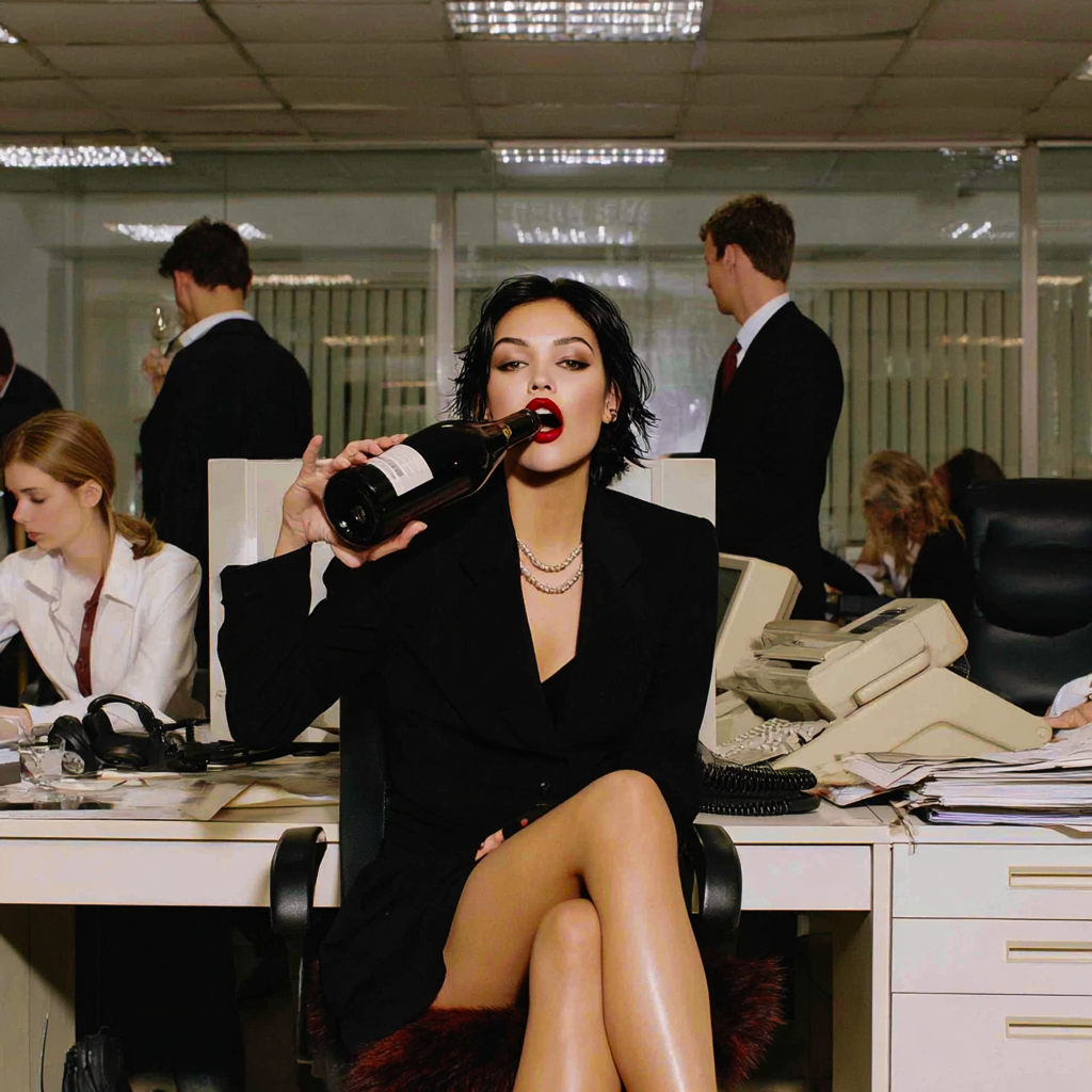
drink the whole bottle. We dare you.
This campaign was designed to stop the scroll and start the conversation. Blitz bottles were placed in settings where wine shouldn’t go: the boardroom, the driver’s seat, spin class. Each image was crafted to spark a double-take. The scenes are glossy, elevated, and just the right amount of scandalous—until you realize it’s just cherry fizz in a wine-shaped bottle.
Blitz doesn’t whisper about sobriety—it shouts. It’s a brand that turns “no thanks” into the loudest thing in the room.

Social Campaign: Drunk Diaries
The confessional that made shame go viral—and sobriety look seductive. Say goodbye to kissing your situationship’s dad on New Year’s. Say hello to Blitz.
That was the formula: a punchline built for chaos and clarity. Each opened with a teaser (“Say goodbye to…”), dropped a real, anonymous drinking confession, and landed with a mic-drop reminder: Blitz exists so you never have to do that again.
Putting the ‘mock’ in mocktail
This project is fictional and was created to showcase brand strategy, visual identity, and campaign thinking. All content and concepts are original.